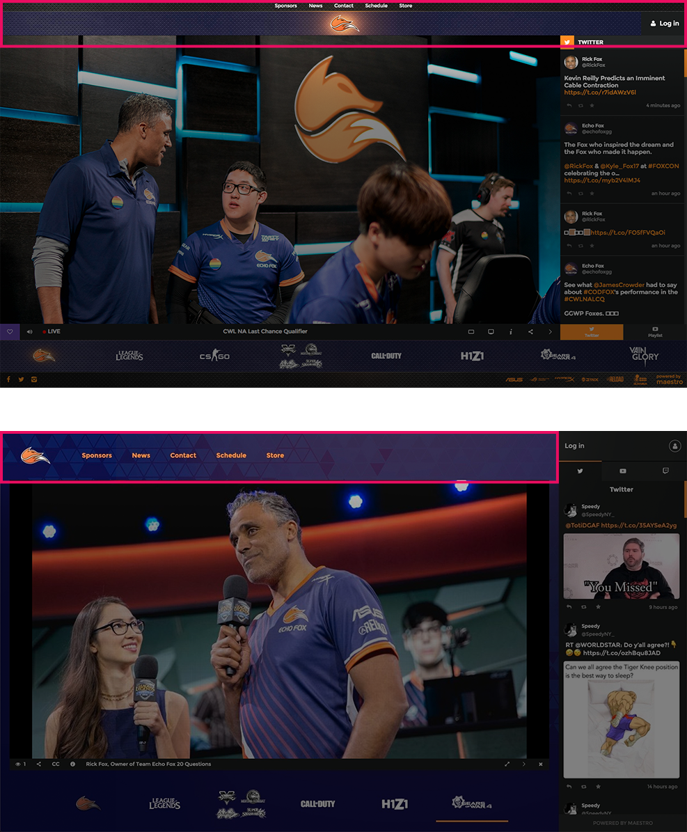
Maestro Interface
Maestro’s needs were changing as a product and the current UI was old and had issues, a refresh was necessary. The challenges in redesigning the layout: simplify while maintaining flexibility for further product changes and creating an interface that looked good with high customization and visual control for clients.
Maestro is a web product designed to be the destination for video content and/or live streaming. The core function was to engage an audience while they watch and collect data in order to improve your strategy. To accommodate different use cases for different clients, Maestro had several states in which it could be in: a video grid style view, a live video view, a unique Maestro-only advertisement/sponsorship view for video ads.
Less Images
The new interface required less images to set up.
Old Interface:
Header background
Logo
Navigation background
Channel Navigation background
Footer background
New Interface:
Logo
Channel background
Different Header
The header was rethought to better optimize the space and not feel so tight. Left aligned logo allowed for navigation links to be placed on the right similar to most websites, this benefitted clients who wanted Maestro feel like an extension of their main site.
Decluttered Footer
By allowing the page to scroll up and down on the left side, many items were able to placed below the fold. This cleared up the amount of visual information from the top position to let uses focus on the video and engaging.
Another problem this solved was having a large amount of sponsors on smaller screens. With a dedicated area below the fold, images were allowed to push the page down more.
Screens
Video grid view with hero banner and scrolling playlists, usually used when the brand wasn’t “Live”
Product with a hidden sidebar
Maestro-only sponsored ad with wrapper style graphics
Role: UI/UX Designer
Tools: Sketch, Photoshop, Invision
Examples on this website are used purely for demonstration purposes and do not accurately reflect how the brand used Maestro.


